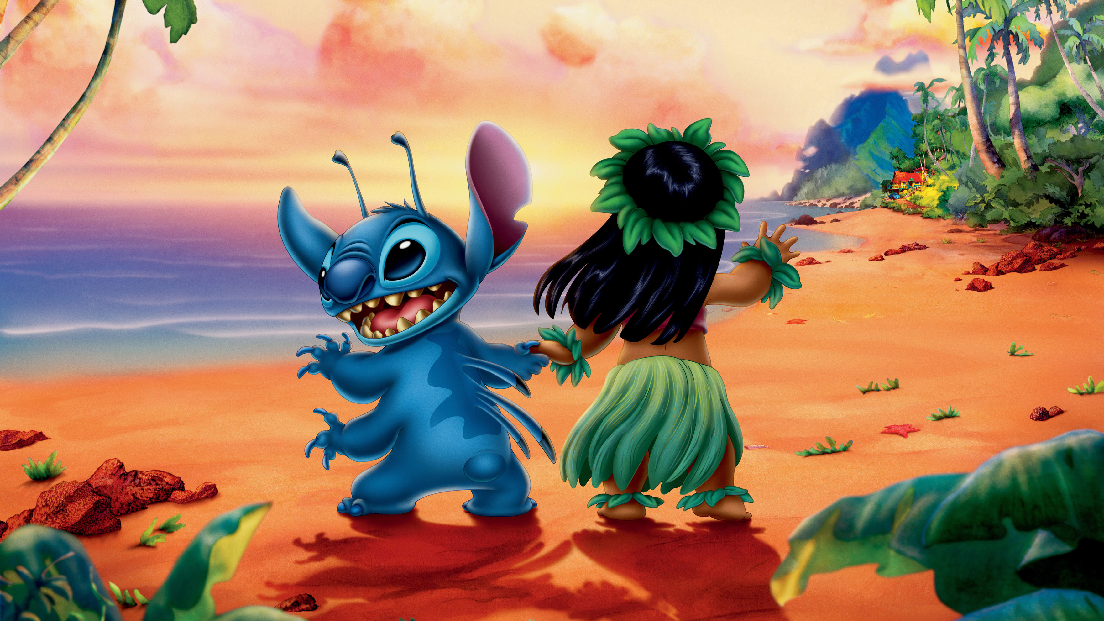
When we think of Disney, a world of magic and imagination comes to mind. But have you ever wondered about the creative process behind its name and logo? Let’s dive into how Disney crafted its identity and what it truly represents.
First up, the name “Disney.” More than just a name, it’s a promise of dreams coming true. Walt Disney envisioned a place where stories come to life, and that spirit is beautifully captured in the brand’s name. It evokes nostalgia, reminding us of childhood adventures and the magic of storytelling that has captivated audiences for generations.
Now, let’s talk about the logo. The iconic Disney script is instantly recognisable, with flowing letters that give off a whimsical, fairy-tale vibe. This simplicity makes it adaptable, whether on a movie poster or a theme park sign. It’s like a warm invitation into a world of wonder and excitement.
Disney’s visual identity doesn’t hold back. Vibrant blues, reds, and yellows are not just eye-catching but also evoke joy and excitement. The typography balances playfulness and elegance, appealing to all ages. Every design choice is intentional, reflecting the brand’s imaginative spirit.
Disney’s brand voice is equally fascinating—playful and empowering, encouraging creativity and adventure. Its messaging invites us to explore new worlds, making us feel part of the story. Whether through films, theme parks, or merchandise, Disney consistently delivers a message of hope and inspiration.
In summary, Disney’s name, logo, visual identity, and tone of voice all reflect its core values of magic, creativity, and family. Each element is carefully crafted to keep Disney a beloved symbol of joy and imagination. As we continue to enjoy Disney’s enchanting stories, it’s clear the brand’s essence lies in its ability to connect with our hearts. What do you think makes Disney so special? Share your thoughts!